OnSong 2024 is here! LEARN MORE
User Manual
Document

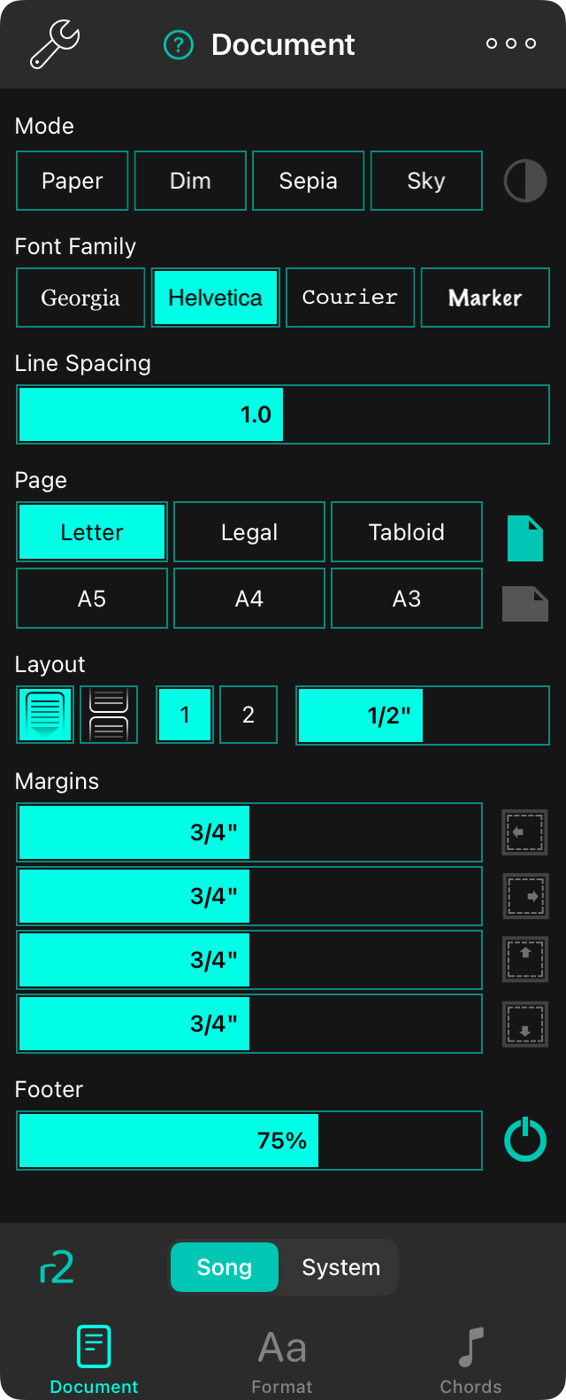
The Document tab lets you change the document settings for each song such as the low light mode, tint color, font, paper size, and margins.
Mode
The mode determines the colors used to draw the song on the screen and can be used to help make the screen more visible in different environments or for users with visual stress disorders. Modes change accordingly for Low Light Mode. If no option is selected, OnSong will display the song using default settings. Options include:
- Paper displays the song in high contrast black and white.
- Dim displays similar to paper, but with lower contrast.
- Sepia displays similar to dim, but with warmed color tones.
- Sky displays the song by overlaying a blue tint to help with visual stress disorders.
Low Light Mode
To the right of the mode buttons is an icon which you can use to toggle low light mode. This is set system-wide when toggled and you'll notice that it applies those changes to the mode we've selected too. This effects all songs and menus in OnSong.

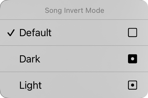
You can also tap and hold on the low light button in iOS/iPadOS 14 and higher to display the Song Invert Mode context menu. From here you can change the low light mode for the specific document. This is set to "default" by default which means that the song document will participate in low light mode as it changes in the system. You can force the song document to be viewed in either dark or light mode here independent on the low light mode set for the app.
Font Family
Four buttons on the top of the menu allow you to choose the font of the entire song. You can choose from:
- Georgia is a serif font that may be easier to read for some users.
- Helvetica is a sans-serif font that is perfect for displaying chord charts. Default.
- Courier is a fixed-width font that is useful in some cases for aligning chords.
- Marker is a handwritten font that is very narrow, allowing more content to fit on the page.
Line Spacing
When you want to fit more onto the screen, consider reducing the line spacing, or space between lines. You can also increase the line spacing for more room between lines for better visibility. You can tap on the icons to the left and right of all sliders to fine-tune adjust each value. Adjusts between 0.7 and 1.3 lines. Default is 1.0.
Page
This lets you set the size of the virtual page which effects the size of the fonts you select. For instance, larger paper sizes will display fonts in a smaller size. The icons on the right allow you to choose between portrait and landscape orientation.
Layout
The layout section lets you define how each page of the document is outputted when you're using the R2 Rendering Engine. This has three controls:
Pagination
This lets you choose to flow the chart down the page with a continuous scrolling sheet, or to break the page into virtual sheets of paper.
Columns
This control lets you choose between one and two columns. When two columns is enabled, the sections of your song are flowed to the other half of the sheet.
Gutter
This is the width of the gutter, the space between the columns. Options include 0" to 1" in 1/16" increments.
Margins
Margins allow you to add an inset on the edges of the virtual paper on the screen. This is useful for making text visible and providing space for Hot Corners or Navigation Zones when also using section selection. The icon on the right side shows when margin is changed: left, right, top, or bottom.
Footer
This allows you to set the size of the foot as a percentage of the lyrics font size. You can also use the button on the right to toggle the footer on and off.
All of the controls on this tab except low light mode applies to the selected song. We will see how to apply our changes to different songs in our library in a little bit.
You can change the default values of each aspects of the document by tapping on the wrench icon in the upper left corner to access the Style Preferences Document options.

