User Manual
Format

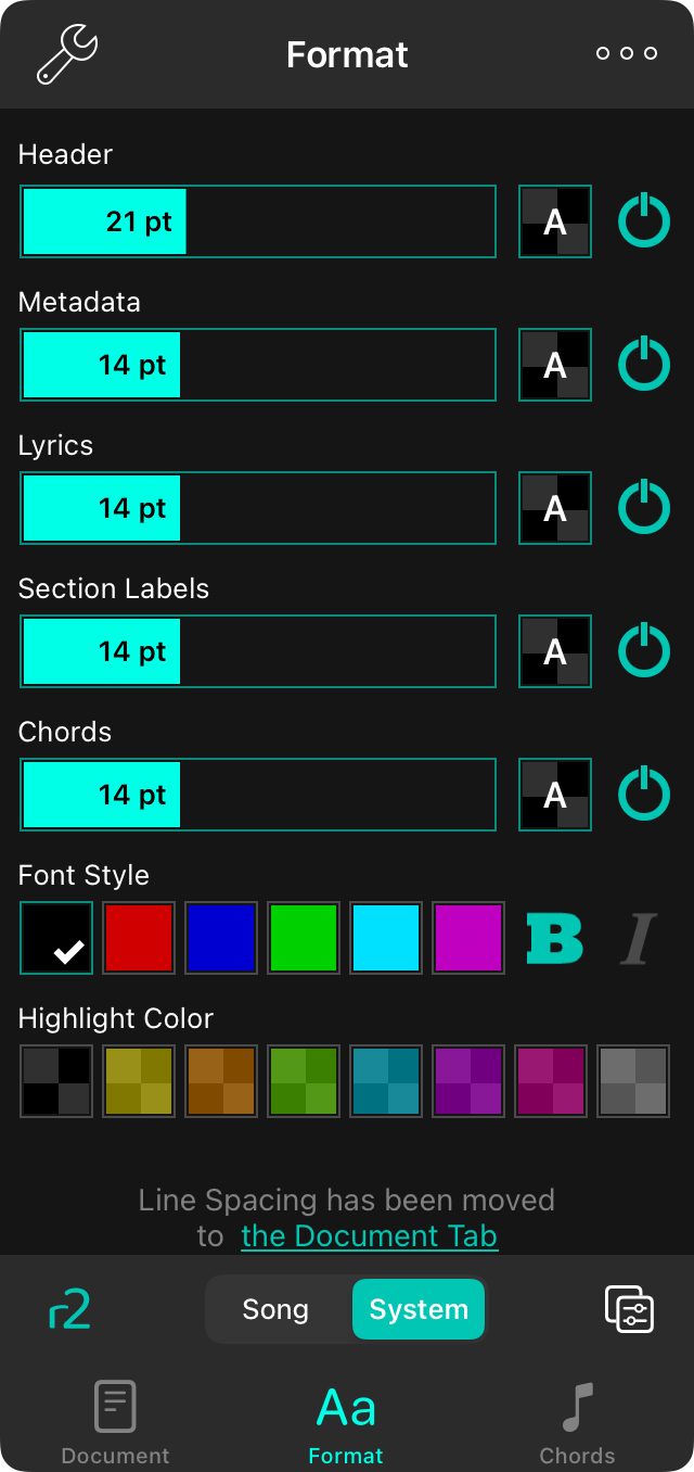
The Format tab lets you change the appearance of the song content. You can change the following aspects of the song.
The style preferences menu is only available for text-based chord charts. If you are viewing an imported file, you will have the option to Extract and Edit or Use Text Version.
Format Sections
The screen contains a list of sections or parts of the song that can be formatted. Each of these sections gives you the ability to set the font size with the slider, or to turn off the item using the power button on the right side. The following sections are displayed by default:
- Header is the title of the song at the top of the sheet.
- Metadata is the information that appears at the top like the artist, key, and tempo.
- Lyrics are all the lyrics of the chart.
- Section Labels are the names given to sections above sections of lyrics.
- Chords appear above lyrics to tell you what notes to play.
More sections can tapping on the lower right corner to Manage Format Sections
Font Style
The font style section appears beneath the selected section and is displayed by default under Chords. You can view the style for each section by tapping the preview switch to the right of the font slider. The font style section contains the following controls
Font Color
This includes color swatches to quickly pick the text color. You can also add font colors and swipe to scroll to more color options.
Bold
You can toggle the bold attribute on and off for the style.
Italic
You can toggle underline on and off for the style.
Highlight Color
You can also change the highlight color of the text using the color picker. You can add more colors by swiping to the right and adding more using the color builder
Manage Format Sections
In the lower right corner you can tap on the toolbar icon to add or remove sections that you'd like to format.


